Previewing
There are many different options to test native functionality depending on your target platforms and needs.
- Run locally in a web browser (using Platform Detection for native functionality)
- Deploy to iOS
- Deploy to Android
Run Locally in a Web Browser
One of the most powerful features of Ionic is that the majority of your app development can happen right in a browser on your desktop. With full access to traditional web development tools (Chrome/Safari/Firefox dev tools), you can write code then test/debug it quickly without having to recompile or deploy to a simulator or device.
To do so, run ionic serve from the command line in the project's directory:
$ ionic serve
> ng run app:serve --host=0.0.0.0 --port=8100

[INFO] Development server running!

       Local: http://localhost:8100
       External: http://192.168.1.169:8100

       Use Ctrl+C to quit this process

[INFO] Browser window opened to http://localhost:8100!
With ionic serve running, continue developing your app. As you save changes, the app reloads with those changes applied.
Note: If the External Link doesn't show up, run ionic serve --external
When implementing native functionality, use Platform Detection. When you're ready to test on a real device, see here for iOS and Android.
Simulating a Mobile Viewport
Each major browser vendor includes developer tools for mobile emulation. These tools offer the ability to change the emulated device type.
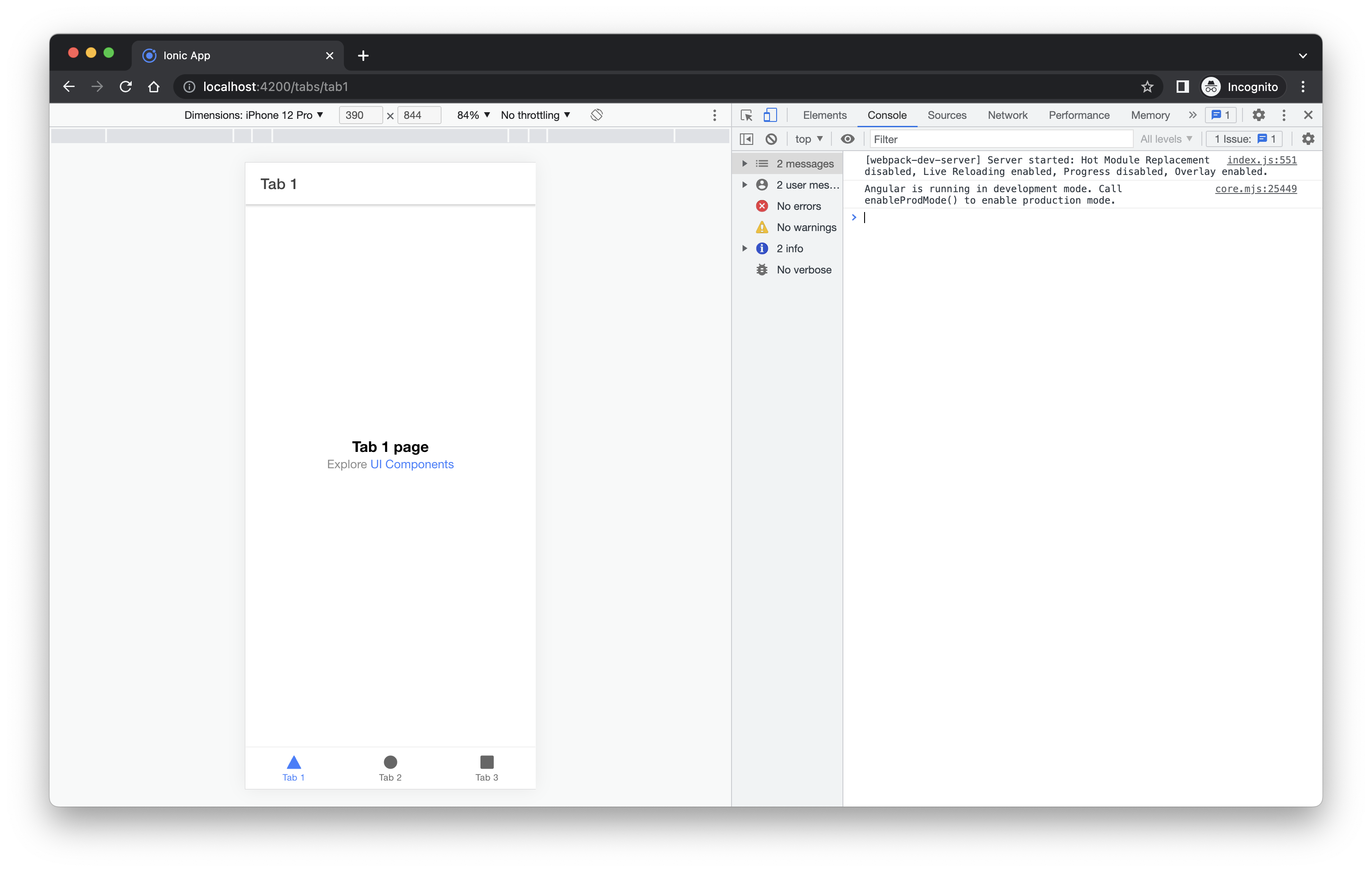
Chrome
Open your application at the local or remote address that it is being served from. For example, http://localhost:4200. Then, open the Chrome developer tools by pressing Ctrl+Shift+I on Windows/Linux or Cmd+Opt+I on Mac.

From here you can select different device types from the dropdown, change the orientation of the device and throttle the network speed.
For additional features and information visit: https://developer.chrome.com/docs/devtools/device-mode/.
Safari
note
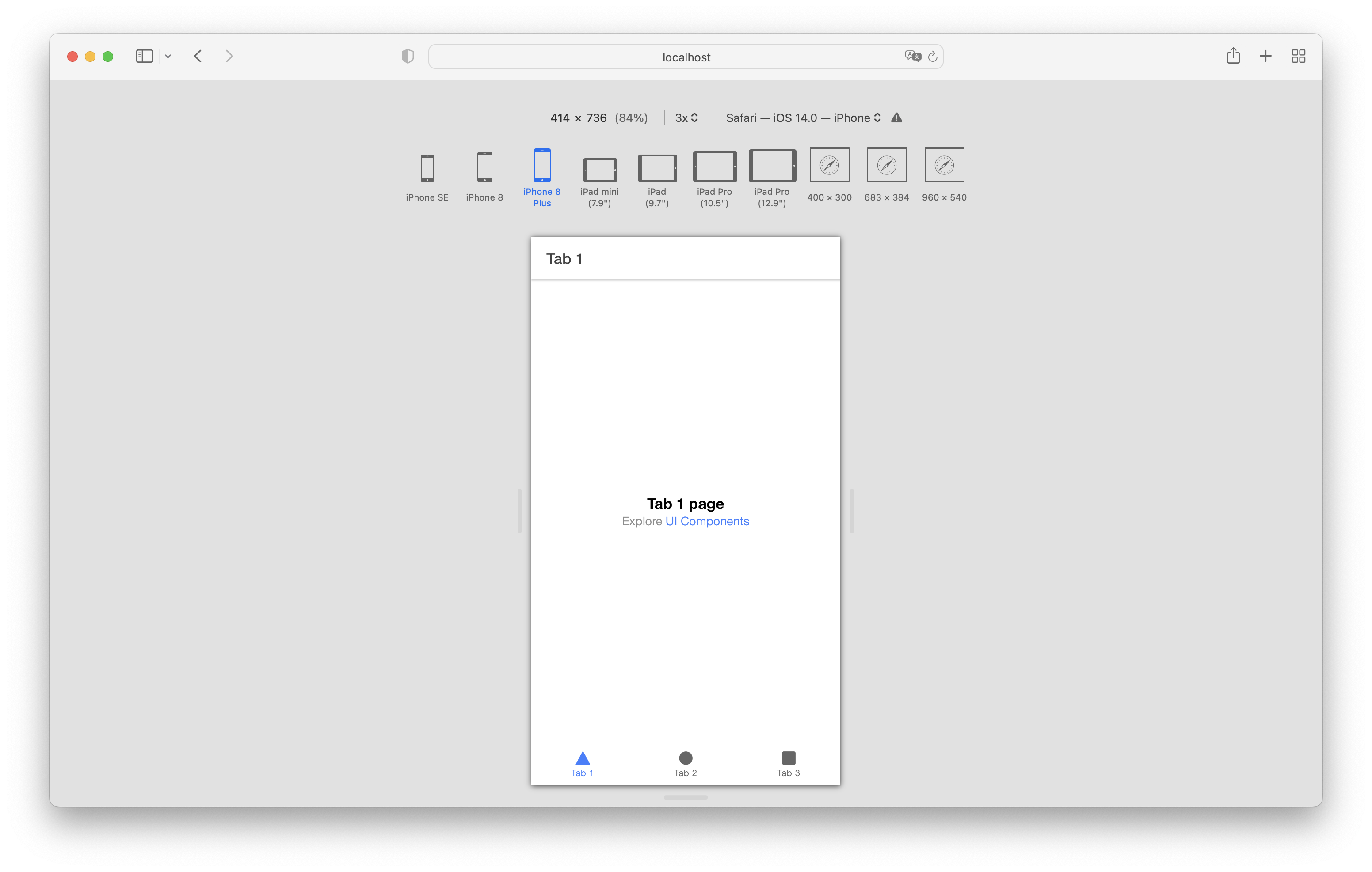
Prerequisites: Show Develop menu in menu bar option must be enabled in Safari Advanced options.
Open your application at the local or remote address that it is being served from. For example, http://localhost:4200. Select the Develop menu in Safari and select Enter Responsive Design Mode . Alternatively you can use the keyboard shortcut Cmd+Opt+R.

From here you can select different device types to emulate as well as change the orientation of the device.
For additional features and information visit: https://developer.apple.com/safari/tools/.
Firefox
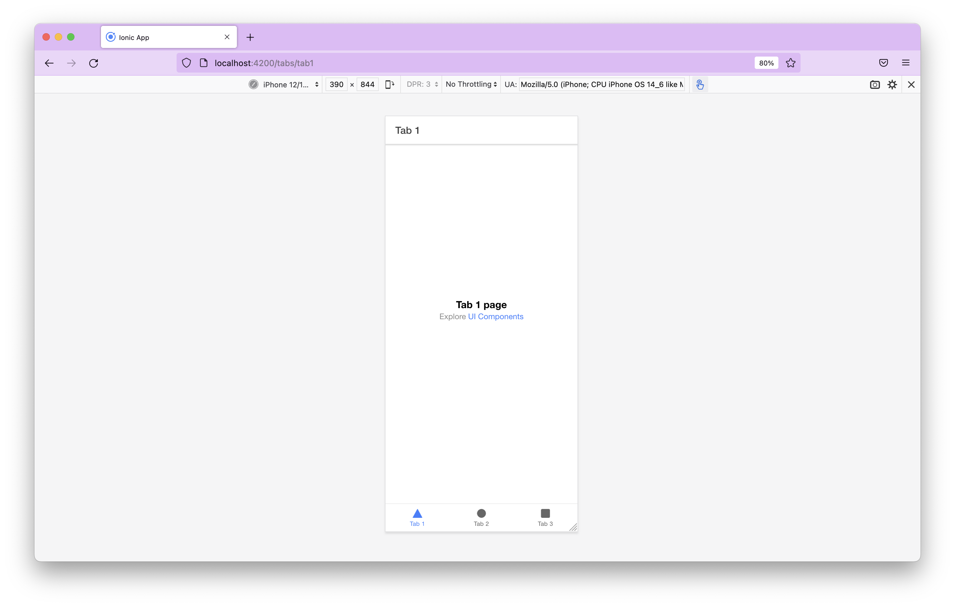
Open your application at the local or remote address that it is being served from. For example, http://localhost:4200. Then, open the Firefox developer tools by pressing Ctrl+Shift+M on Windows/Linux or Cmd+Opt+M on Mac.

From here you can select different device types from the dropdown, change the orientation of the device and throttle the network speed.
For additional features and information visit: https://firefox-source-docs.mozilla.org/devtools-user/responsive_design_mode/.